Need to amp up your jewelry creations?
Be confident and experimental when choosing color combinations. Selecting what colors that match is a skill that you should hone to step up your jewelry creations.
In this article, we’ve put together some of the most interesting (and surprising) color combinations that will help you create an array of jewelry designs that are sure to impress.
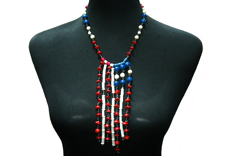
Dark Blue and Red. This color is like a clash of fire and water. Blue represents tranquility, trustworthiness, and security while red means danger and passion. It may seem like a clash for some but blue and red is a color combo that has been proven effective for branding. If brands have relied on this combo, then you can rely on it as well! With the inclusion of white, there’s no denying that the end product is a striking and highly effective color combination.
Beige and Brown. Think cozy brown leather couches placed in a room with walls in the shade of beige. Though one may have the impression of an interior design, you can’t help but feel the comfort and warmth when beige and brown are combined. Beige is calm yet versatile and brown is a solid tone — these two are without a doubt in perfect harmony.
Orange and Blue. They say that opposites attract. When it comes to jewelry, blue and orange are great examples. Blue is a color that can help orange radiate its warmth. Blue may be commonly used as a cool tone and is always impressive if you want a regal look. But a pop of orange shows that you’re not afraid of a little “attention”.
Mint and Navy. If you’re the type who like bold jewelry designs, then try navy and mint. Navy and mint is an unexpected combo and that’s what makes it special. Mint is fresh and very trendy while navy is rich and commands authority. When combined, the result is fascinating but still elegant.
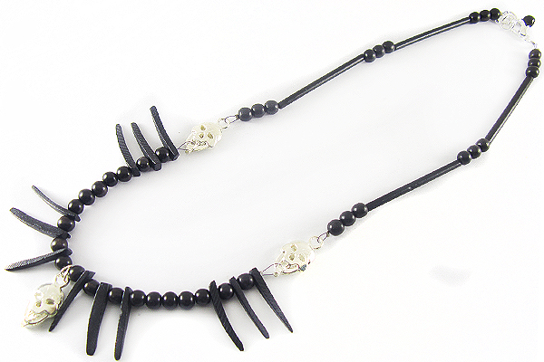
Black and White. Think of classic color combinations and black and white come to mind. Some people might think that this is too common and that it could remain stagnant. This combo works since it provides the perfect balance. While white is pure and peaceful, black gives off a dominion vibe. If you place them side by side, the two colors certainly complement each other — white is emphasized and black is intensified. The result is a modern, clean, and minimal jewelry.
In the beading community, it’s apparently not enough to work with just one color. The real spark of creativity lies in how you work two or even three colors together. Knowing what colors go together is one thing, but experimenting with interesting and compelling color combinations is another. We hope you take a cue from our variety of color combinations and incorporate them in your future jewelry creations!


