Color is practically the “lifeblood” of good design, in this case —beaded jewelry designs. Color can work for or against your design. Color can set the mood of a jewelry piece —as an example: use a playful mix of bright colors to express a “happy” design. The key, really, is to “combine” colors harmoniously in such that it attracts the eyes, not repel it.
Here are some tidbits and practical tips on using colors that can work for your designs:
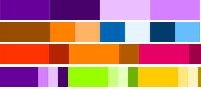
- Use color schemes to build your design ideas with —I personally find it a lot easier to start working on a design idea using my favorite scheme (I usually go for a “monochromatic” look) as the framework. As a refresher, here are 4 of the most used color schemes for every serious artist:
- Monochromatic—uses a key color (example: amethyst) in combination with its various tones, shades and tints (lightness and darkness) to achieve a balanced look

- Complementary—uses a dominant /base color (example: brown) in contrast with the color directly across it in the color wheel —use the complementary color as accent
- Analogous—the curious combination of colors right next to each other (example: red); may not be as vibrant as the complementary scheme though a lot richer than the monochromatic
- Split-complementary—this is a variation to the standard “complementary” scheme in that it uses a key color (example: violet) in combination with its complementary color’s two adjacent colors achieving a higher contrast
- Monochromatic—uses a key color (example: amethyst) in combination with its various tones, shades and tints (lightness and darkness) to achieve a balanced look
- Working around a themewill add character (personal signature) to your designs —with a color scheme in place, a chosen theme will guide the process of creating your design ideas. Choosing design themes can be really easy —it can be according to each season(example: winter), or style (example: classic), or culture (example: ethnic), or occasion(example: bridal)
- Give careful consideration to different color symbolism across cultures(that is, of course, if you plan to sell jewelry across the globe!) —Colors can convey different meanings as much as the written words. Here are a few samples of this cross-cultural color symbolism:
- Black—it symbolizes death, as well as style and elegance in most Western nations. It also implies trust and high quality in China.
- Red—expresses mourning for South Africans, but it signals good luck and fortune for the Chinese. It can also signify masculinity in some parts of Europe.
- Yellow-distinguishes a feminine character in the US and many countries, but it can convey mourning in Mexico
- Purple—is a symbol of expense for most Asian nations, but it signifies mourning in Brazil. It also expresses freshness and good health n many Western nations.
- Green—it signifies h-tech in Japan, but it is a forbidden color in Indonesia.It can also mean luck for Middle East nations
- Blue —it symbolizes immortality in Iran
- Pink —it is the symbol of femininity in the US and most Asian nations
- White —it signifies mourning in Japan and other far eastern nations, but it also conveys purity and cleanliness in most Western nations
- Brown —it means disapproval for the Nicaraguans


The choice and combination of colors make up your color palette. Use your palettes to achieve a pleasant color harmony to make your jewelry designs stand out.